If you have ever watched a live win-probability graph during a college football game, you have seen it do something that looks broken: a team sits at 80%, throws one incompletion, and the line barely moves — then two plays later a strip-sack drops it to 25% in a single tick. People email me to ask whether the model is just guessing. It isn't. The jumpiness is the honest part. A win-probability model is a thermometer, not a thermostat, and late in a one-score game the temperature really does swing that hard. What I want to do here is build the thing from the inside so you can see exactly where the swings come from — and where the model is quietly lying to you.
What a win-probability model actually is
Strip away the marketing and a win-probability (WP) model is one function: it takes the current game state and returns a single number between 0 and 1. Pregame, the "state" is basically one input — the projected scoring margin, which is just the point spread with the sign flipped. The cleanest way to turn a margin into a probability is the logistic function:
P(win) = 1 / (1 + e−b × margin)
Here margin is how many points you are projected to win by (favorites positive), and b is a single slope coefficient that controls how steep the curve is. That's the entire pregame model. Everything fancier — in-game models that fold in score, time, down, distance, and field position — is the same idea with more inputs feeding the exponent.
The curve, and why its steepness is everything
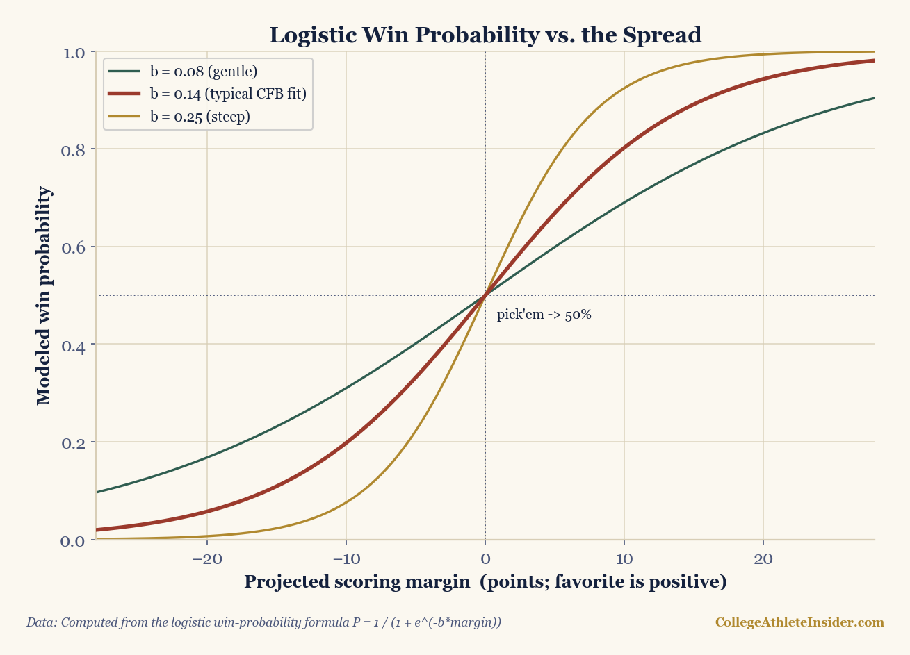
b decides how fast probability piles up as the projected margin grows. The middle curve (b ≈ 0.14) is in the range a logistic fit to college spreads tends to land. Computed from the formula P = 1 / (1 + e^(−b×margin)) — no game results are charted.Read the middle curve, the one near a realistic college fit. At a margin of zero — a true pick'em — every model has to say 50%. Nudge the projected margin to +3, a field-goal favorite, and the curve gives about 60%. Push to +7 and it's roughly 73%. At +14 it's near 88%. Those are not numbers I looked up; they fall straight out of the formula, which is the point — a logistic model is fully reproducible from one coefficient.
Work one out by hand
Say the rating system makes Team A a 7-point favorite, and we use b = 0.14. Plug it in:
- Exponent: −b × margin = −0.14 × 7 = −0.98
- e−0.98 ≈ 0.375
- P = 1 / (1 + 0.375) = 1 / 1.375 ≈ 0.727
So a touchdown favorite wins about 73% of the time under this model — which, satisfyingly, is close to what touchdown favorites actually do historically. Flip it for the underdog: 1 − 0.727 = 0.273. The whole pregame model is that calculator. Want to feel how the slope changes the answer, or how a few points of spread move the number? Run margins through the efficiency and rating math on the Calculators hub.
Where the in-game swings come from
The pregame curve is smooth. So why does the live graph lurch? Because in-game the margin in that exponent is replaced by an estimate of the final margin built from the current score plus how much scoring time is left — and as the clock drains, the model trusts the current score more and more. Early, a 10-point lead is worth maybe 75%; the model knows there are 50 minutes for it to evaporate. With four minutes left, that same 10-point lead is worth 95%+, because there is no longer enough time for the trailing team to climb back. The probability isn't reacting to the lead; it's reacting to the shrinking number of possessions remaining.
That is also why one snap can move the line 40 or 50 points of probability late in a tight game. Picture a team down 4 with the ball at the opponent's 5-yard line, 25 seconds on the clock (an illustrative situation, not a real game). A touchdown there flips them from a coin-flip-ish loser to an almost-certain winner — a single play that the model correctly scores as enormous, because it is enormous. Analysts call this leverage: the amount of win probability riding on one snap. Leverage is near zero in the first quarter and can be the entire game in the fourth. A WP graph that didn't swing in those moments would be the broken one.
Where these models mislead
I trust win-probability graphs, but only after I know their failure modes:
- The slope isn't universal. The
bI used is a stand-in. Fit the logistic to a real spread-vs-outcome dataset and you get a specific number, and it drifts by era, by division, and by how you treat overtime. Anyone quoting WP to two decimal places is overselling the precision. - Pregame WP is only as good as the spread. If the model's input margin comes from a betting line, it has already absorbed injuries and weather the box score can't see — great. If it comes from a raw rating that ignores a starting quarterback being out, the WP inherits that blind spot completely.
- Garbage time poisons the inputs. Late scores in a decided game barely move a good WP model but badly distort the season stats that feed the next game's rating. The model can be right today and wrong tomorrow for that reason.
- Calibration is the only real test. A WP model is "good" if, across all the times it said 70%, the favorite actually won about 70% of the time. That's a property you have to measure, not assume — and a confident-looking curve can still be miscalibrated.
How to fit it for real
Building the honest version is short: gather games with a pregame margin (the spread) and a binary win/loss, then fit a logistic regression of the outcome on the margin. The regression hands you b directly. For an in-game model you swap the single margin for a small feature set — score differential, time remaining, down, distance, field position — and fit the same logistic link on play-by-play. It is the exact same function in this article; you are only changing what goes into the exponent. That continuity is why I like teaching the one-line pregame version first: every live WP graph on television is this curve wearing more clothes.
Sources & further reading
- Background: Chapter 21: Win Probability Models (DataField.dev).
- The logistic link and calibration are standard in sports modeling; the curve here is computed directly from the formula, not from game data.
- Related: Success Rate and EPA, explained from scratch — the play-level inputs an in-game WP model leans on.
- Related: How SP+ and adjusted efficiency work — where a team's projected margin comes from.
- Related: Bracket math: seed gaps and upset odds — the same probability thinking applied to single-elimination.
- Try it: the Calculators hub for running margins and ratings yourself.