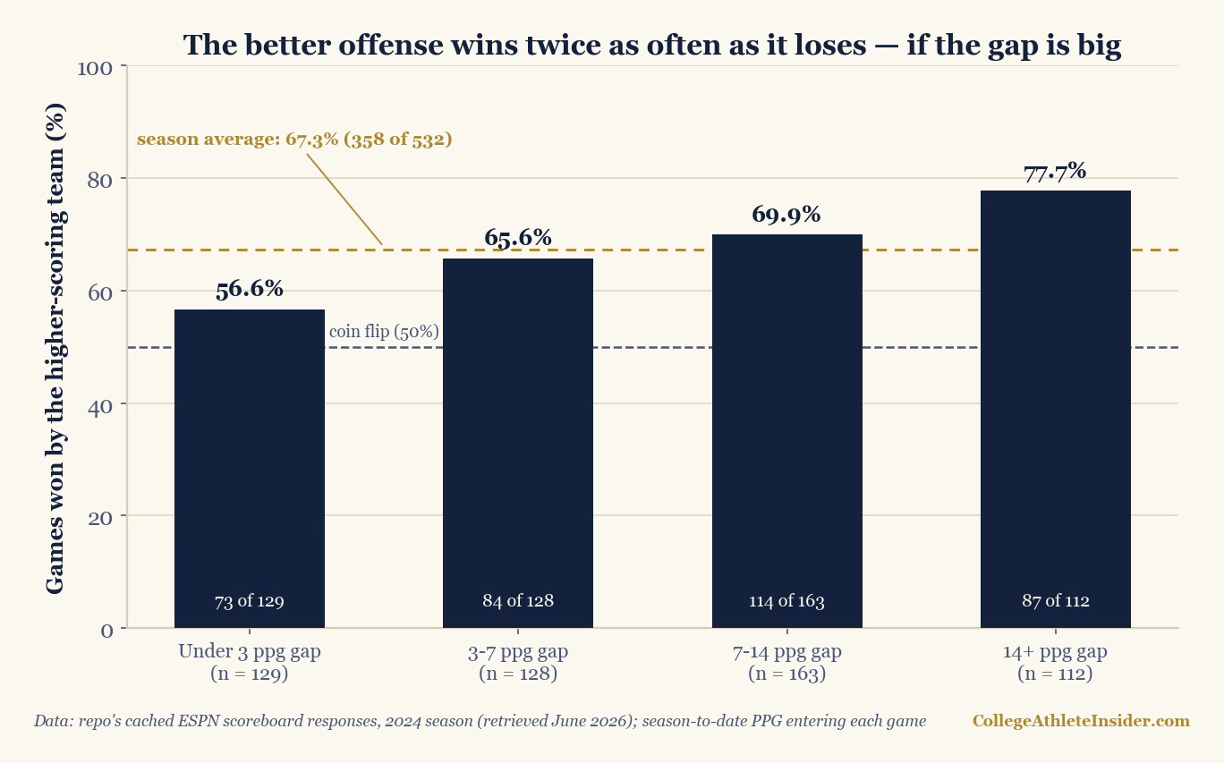
Turn on any broadcast and someone will tell you, within the first ten minutes, that one of these teams “puts up 41 a game.” The number is delivered as though it settles something. So I measured what it actually settles, using this site’s cached 2024 season: in 532 games where both teams arrived with a meaningful season-to-date scoring average, the team with the higher average won 358 of them — 67.3%, twice as often as it lost. That is the whole answer, and it is a strange one: a two-to-one edge that no one should ever feel safe about, because when the two averages sat within three points of each other the “better offense” won just 56.6% — and the loudest scoring average in the entire sample belonged to an Ole Miss team that lost that very week, at home, to a Kentucky side scoring 22.5.
What I measured, exactly
The data is the same cached set of ESPN scoreboard responses behind the home-field piece and the Pythagorean piece: 877 completed 2024 college football games, August 24 through the CFP first round on December 21 (as retrieved June 2026; the quarterfinals and the January bowls are not in the cache, so nothing here speaks to them). I sorted every team’s games by date and carried a running points-for total, so that each game knows both teams’ scoring average entering kickoff — prior games only, nothing leaking backward from the game being predicted.
“Better offense” means exactly what a broadcast graphic means by it: the higher season-to-date points per game. No opponent adjustment, no pace adjustment, no wrinkle. To keep week-two noise out, a game only enters the sample when both teams brought at least four prior cached games — which yields 533 games from September 27 onward, and as a side effect keeps FCS visitors out entirely (they appear once or twice in the cache and never qualify). One game had to be thrown out on a technicality I did not expect to encounter: Iowa State and UCF met on October 19 with entering averages identical to the second decimal, 30.67 apiece. No “better offense” existed that afternoon. The other 532 games had one, and it won 358 times.
The answer, banded
A single 67.3% flattens the interesting part, which is how fast the pick decays as the gap closes. Band the games by the size of the entering points-per-game gap and it behaves like a dose-response curve:
| Entering PPG gap | Games | Better offense won | Win rate | Avg. margin, better-offense side |
|---|---|---|---|---|
| Under 3 | 129 | 73 | 56.6% | +2.3 |
| 3–7 | 128 | 84 | 65.6% | +5.7 |
| 7–14 | 163 | 114 | 69.9% | +9.6 |
| 14+ | 112 | 87 | 77.7% | +13.5 |
| All games | 532 | 358 | 67.3% | +7.7 |
The median gap in the sample is 7.2 points per game, so the two right-hand bands are not exotic matchups — they are half the schedule. And the bands are honest in the margins, not just the win rates: the under-3 games were decided by an average of +2.3 in the better offense’s favor (a one-score league, in other words), while the 14+ games ran +13.5. The pattern also survives the obvious slicings. Conference games alone: 313 of 467, 67.0%. Non-conference games alone: 45 of 65, 69.2%. Raise the entry bar from four prior games to five and the overall rate moves from 67.3% to 67.0%; lower it to three and it lands on 67.3% again. The number does not care how I hold it.
What the right-hand band looks like in practice: November 2, Ohio State (40.3 a game through seven) visited Penn State (33.3 through seven). A seven-point gap on paper, a 20–13 Ohio State win on the field — the band delivered its favorite, and the final was still a one-score game. That is what a 70%-band game feels like from the couch: right more often than not, comfortable almost never.
A worked example: 55 a game walks into a 20–17 loss
The largest entering gap in the whole sample that failed is the article’s cautionary tale. On September 28, Ole Miss hosted Kentucky averaging 55.0 points a game, the gaudiest number any team carried into any qualifying game all season. Here is where those 220 points in four games came from, straight out of the cache: 76–0 over Furman, 52–3 over Middle Tennessee, 40–6 at Wake Forest, 52–13 over Georgia Southern — 22 points allowed, total, against a slate containing one FCS program and zero teams that would finish anywhere near a ranking. Kentucky arrived 2–2, scoring 22.5. The gap was 32.5 points per game, the third-largest of the season and the largest that lost. Kentucky won, 20–17, in Oxford.
The point is not that the stat is worthless — the very largest gap of the season (Navy at 46.0 visiting Air Force at 12.5 on October 5, a 33.5-point spread of averages) resolved exactly as billed, 34–7. The point is that a September scoring average is two numbers multiplied together — how good the offense is, and who it was allowed to play — and the second factor can be most of the product. Ole Miss’s 55 was manufactured against Furman and friends; Kentucky’s 22.5 came against a slate that included Georgia and South Carolina. The averages were never measuring the same thing. This is the single biggest reason the under-3 band is nearly a coin flip and why the stat misfires when it misfires: the gap between two averages is only as real as the schedules underneath them.
Offense, defense, or margin — which edge picks better?
Run the identical procedure on the other side of the ball and the defensive version comes out weaker: the team allowing fewer points per game entering kickoff won 333 of 531 (62.7%; two games tied on the defensive average and are excluded). In 2024’s cache, “they score on everybody” out-picked “nobody scores on them,” 67.3% to 62.7%. And in the 201 games where the two credentials pointed at different teams — one side with the better offense, the other with the better defense — the better offense won 113, or 56.2%. A real tilt toward the shootout side, and a modest one; anyone declaring “offense wins championships” off a 56–44 split in one season is drawing a trend through a coin that came up heads a few extra times (a failure mode the close-game-luck piece covers in detail).
The composite — entering scoring margin, points for minus points against — picked winners at 67.9% (361 of 532, one tie excluded). Better than offense alone by all of six-tenths of a point. That near-tie is itself informative: points-for and points-against travel through the same soft schedules together, so folding in the defense mostly double-counts the same information. The schedule contamination, not the side of the ball, is the binding constraint on how much a raw average can know.
The home-field entanglement
One more cut, because it changes how the headline number should be used. When the better offense was also the home team, it won 202 of 266 — 75.9%. On the road, 148 of 253 — 58.5% (the 13 neutral-site games split 8–5). A 17.4-point swing is far more than the roughly three points of genuine home edge this site measured from the same cache, and the surplus is our old friend again: who is at home is not random. High-scoring teams hosting are disproportionately strong programs in games arranged to be won; high-scoring teams traveling include a lot of mid-major road trips into stadiums that pay them to visit. The stat, the venue, and the schedule are one tangled variable wearing three names.
Where this can mislead you
- One season, one cache. 532 games is a real sample, but a single year measured once. The window is September 27 to December 21, 2024, per the bundled cache; the CFP quarterfinals onward and all January bowls are absent, and I claim nothing about them.
- The schedule confound is the story, not a footnote. Among established FBS teams in the cache (six or more appearances), scoring ran 30.3 a game in non-conference play against 26.8 in conference play — a 3.5-point inflation baked into every early-season average by design, because September slates are paid mismatches. An entering PPG is always part talent, part menu. The Ole Miss example above is that sentence with a scoreboard attached.
- Points per game is a blunt instrument on purpose. It ignores pace (a fast mediocre offense out-averages a slow good one — the points-per-drive piece exists because of this) and ignores opponent strength entirely. I measured the broadcast stat because it is the one people quote, not because it is the best available.
- The bands are conventional, not optimized. I cut at 3, 7, and 14 because those are football’s round numbers. Nothing was tuned; nothing else was tried first.
- No betting claim is being made. 67.3% against the scoreboard is not 67.3% against a point spread — the market already prices scoring averages, and then some. This is a measurement of a talking point, not an edge.
- Threshold choice barely matters, but it exists. Requiring three prior games instead of four gives 67.3% (399 of 593); requiring five gives 67.0% (309 of 461). I report the four-game version because it starts the clock once averages mean something.
The takeaway
“They average 41 a game” is a two-to-one prophet: across 532 cached games the better offense won 67.3%, and when its edge was big — fourteen or more points per game — it won 77.7%. But the same measurement says the stat is at its most confident exactly where it is least trustworthy: the huge September averages are the schedule talking, and in the matchups that feel like genuine arguments — two offenses within a field goal per game of each other — it picks winners at 56.6%, a coin with a thumb on it. A scoring average is a real signal soaked in schedule. Wring the schedule out — the way Pythagorean expectation starts to and a proper game model does explicitly — and you can keep the signal without quoting the noise.
Reproduce it
The whole computation is a running total and a comparison. The chart above is rebuilt from the cache every time the site’s charts build, by charts/chart_better_offense.py, which warns if any published number stops reproducing; the core of it fits in a screenful:
games.sort(key=lambda g: (g["date"], g["id"]))   # 877 completed 2024 games
run = defaultdict(lambda: {"gp": 0, "pf": 0})    # per-team running totals
for g in games:                                  # entering PPG, then update
    h, a = run[g["hid"]], run[g["aid"]]
    if h["gp"] >= 4 and a["gp"] >= 4:            # both teams: 4+ prior games
        h_ppg, a_ppg = h["pf"] / h["gp"], a["pf"] / a["gp"]
        if h_ppg != a_ppg:                       # one exact tie skipped
            pick_won = (h_ppg > a_ppg) == (g["hs"] > g["as"])
            tally(abs(h_ppg - a_ppg), pick_won)  # -> 358 of 532, 67.3%
    h["gp"] += 1; h["pf"] += g["hs"]
    a["gp"] += 1; a["pf"] += g["as"]
Run python charts/chart_better_offense.py and it prints every band count in this article before it draws a single bar.
Sources & further reading
- Theory: Chapter 18: Game Outcome Prediction — a free chapter at DataField.dev on doing this properly, with opponent adjustment.
- Data: my locally cached ESPN public-API scoreboard responses (
scripts/cache/, retrieved June 2026; provenance indata_layer/SOURCE.txt) — 877 completed 2024 games, August 24 through the CFP first round on December 21; the qualifying sample is 533 games from September 27 on, with one exact-tie game excluded. - Every figure above — the band table, the offense/defense/margin comparison, and the chart — is recomputed from that cache by
charts/chart_better_offense.py, which warns at build time if the numbers drift. - Related: home-field advantage, measured (the same cache, the same schedule confound from another angle), points per drive (why raw PPG flatters fast offenses), and one-score records and luck (why 56–45-style splits deserve suspicion).