The win-probability graph — that swooping line that shows a game tilting back and forth — looks like serious data science. It mostly isn't, at least not to display: ESPN already computes the series and serves it through a public endpoint. Your job is to fetch it and draw it. Here's how, in a dozen lines, no API key required. Full code: scripts/win-probability-chart-python.py.
Where the data lives
Every game summary from ESPN's public API includes a winprobability array — one entry per play, each with a homeWinPercentage from 0 to 1. Grab a game's event id (from the scoreboard endpoint) and pull its summary:
import urllib.request, json
BASE = "https://site.api.espn.com/apis/site/v2/sports/football/college-football"
event = "401551786"   # 2024 Rose Bowl: Michigan vs Alabama
s = json.loads(urllib.request.urlopen(f"{BASE}/summary?event={event}").read())
wp = s["winprobability"]
home_wp = [p["homeWinPercentage"] * 100 for p in wp]
print(len(home_wp), "win-probability points")Draw the game flow
A win-probability chart is just that list plotted against play number, with a 50% reference line and the area shaded by who's favored:
import matplotlib.pyplot as plt
x = range(len(home_wp))
fig, ax = plt.subplots(figsize=(8.6, 4.6))
ax.fill_between(x, home_wp, 50, where=[v >= 50 for v in home_wp], alpha=0.25)
ax.plot(x, home_wp)
ax.axhline(50, ls=":")
ax.set_ylim(0, 100)
ax.set_ylabel("Home win probability (%)")The result
For the 2024 Rose Bowl — Michigan and Alabama's overtime classic — the series tells the whole story:
Alabama Crimson Tide at Michigan Wolverines: 168 win-prob points.
Michigan win prob ranged 5% to 100% (swing 95 pts).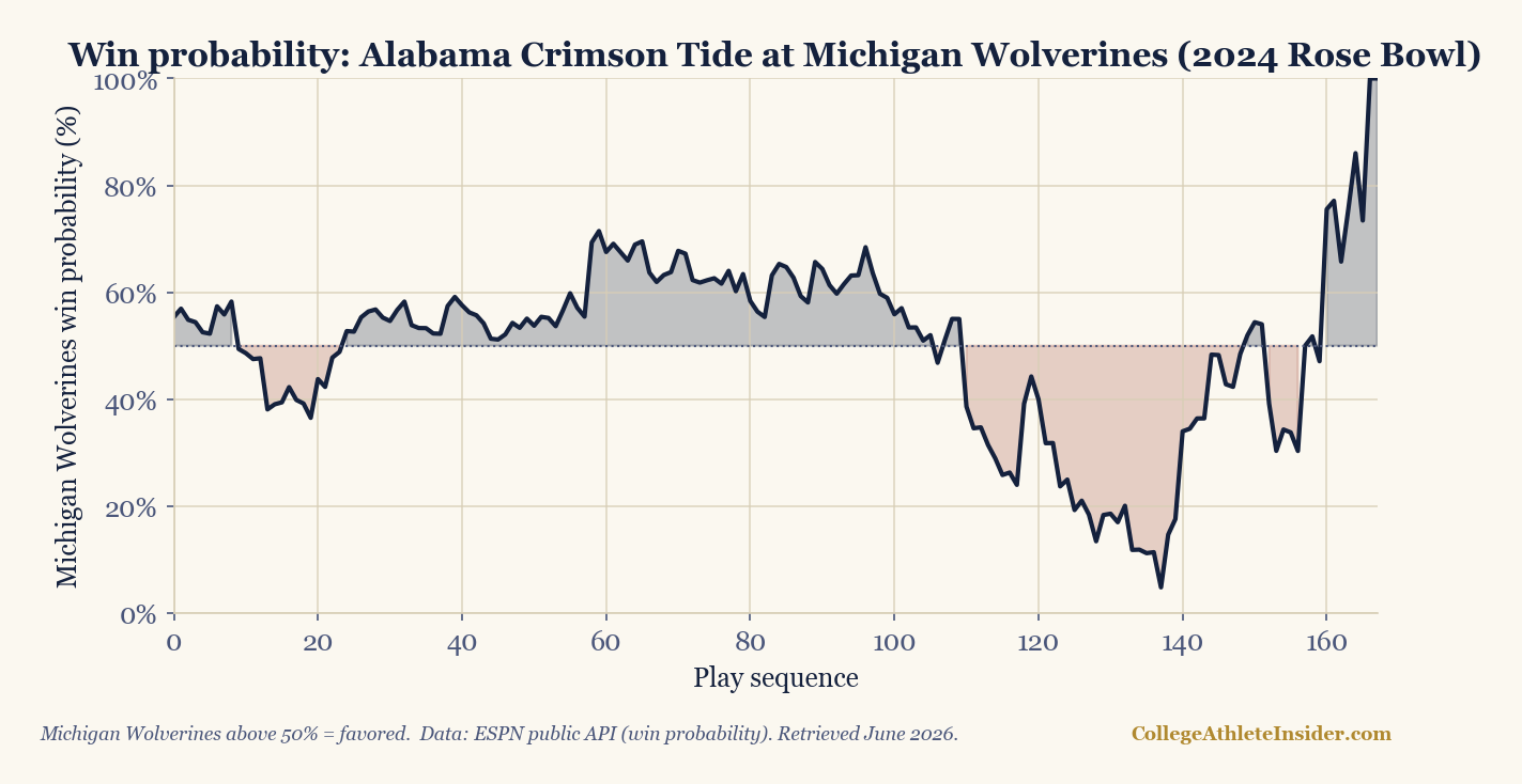
That single number — a 95-point swing — quantifies "instant classic." The "excitement index" some sites publish is essentially the total movement in this line; you could compute your own by summing the absolute change between consecutive points.
A caveat worth stating
This is ESPN's model, not yours. Its win-probability values bake in assumptions (about field position, time, timeouts, and team strength) you didn't make and can't fully see. That's fine for visualizing a game's drama, but don't treat a vendor's win probability as ground truth for analysis — if you want a model you understand and can defend, build one (our logistic-regression tutorial is a start). Display ESPN's; trust your own.
Extend it
- Annotate scoring plays. The summary's
scoringPlayslist lets you mark touchdowns on the timeline. - Compute an excitement score = sum of absolute changes; rank a weekend's games by it.
- Basketball works too — swap the sport path for men's or women's hoops.
Sources & further reading
- ESPN public API (game summary win probability)
- Companion code:
scripts/win-probability-chart-python.py - Related: Predict games with logistic regression · Publication-quality charts