A season is a story, and the simplest way to see its arc is to plot a team's scoring margin game by game. Blowouts, nail-biters, the bad loss, the turnaround — they all jump out of a single bar chart. This is the gentlest possible data-viz tutorial, and a perfect first project. The full script is reproduced below.
Get one team's games in order
Using the shared season helper (ESPN results), filter to the games involving your team and compute the margin from that team's perspective:
from _cfb_season import season_games
games = sorted(season_games(2024), key=lambda g: g["week"])
log = []
for g in games:
    if g["home"] == "OSU":
        log.append((g["week"], g["away"], g["hs"] - g["as"]))
    elif g["away"] == "OSU":
log.append((g["week"], g["home"], g["as"] - g["hs"])) # flip sign on the roadPlot it
Color the bars by win (navy) or loss (brick), and add a line for the season average:
ys = [m for _, _, m in log]
colors = ["#14213d" if m >= 0 else "#9b3a2c" for m in ys]
ax.bar(range(len(ys)), ys, color=colors)
ax.axhline(sum(ys)/len(ys), ls="--")     # season average margin
The result
Ohio State 2024 game-by-game margin:
  Wk 1 vs AKR  +46     Wk 7 vs ORE   -1
  Wk 2 vs WMU  +56     Wk 9 vs NEB   +4
  Wk 4 vs MRSH +35     Wk10 vs PSU   +7
  Wk 5 vs MSU  +31     Wk11 vs PUR  +45
  Wk 6 vs IOWA +28     Wk12 vs NU   +24
                       Wk13 vs IU   +23
                       Wk14 vs MICH  -3
Average margin: +24.6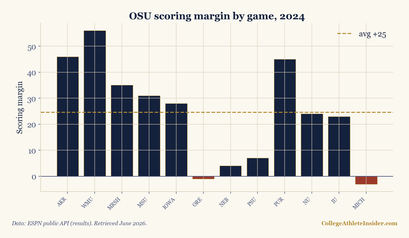
The chart tells the season's story at a glance: a +24.6 average margin built on early blowouts, then the two losses that nearly ended the playoff dream — a one-point heartbreaker to Oregon and a three-point stunner to Michigan in the finale. What it can't show is the twist: this team then won four straight playoff games to win the national title. A margin chart captures the regular-season arc beautifully — and reminds you why we don't crown champions by average margin alone (see the Elo tutorial, where this same Ohio State ranks only 12th).
Variations
- Rolling average. Add a 3-game moving line to smooth the noise and reveal momentum.
- Cap the bars at ±28 to keep one 56-point blowout from dominating the axis.
- Overlay opponent quality by coloring bars by the opponent's rank — a tough loss looks different from a bad one.
Sources & further reading
- Chapter 3: Python for Sports Analytics, DataField.dev.
- ESPN public API (results) — via
scripts/_cfb_season.py - Companion script, kept in my build repository and not published:
scripts/cfb-scoring-margin-trend-python.py - Related: Publication-quality charts · Build an Elo rating