Most real analysis isn't one clever script — it's a small, boring pipeline you can rerun whenever the data changes: get data into a CSV, read and transform it with pandas, draw a chart. Build that loop once and updating an analysis becomes a single command. Here's the pattern, end to end. Full code: scripts/csv-to-chart-pipeline-python.py.
The three stages
1. Produce a CSV. Your source can be anything — an API, a download, a hand-built sheet. Here we compute 2024 FBS win totals from public results and write them out:
import csv
with open("wins-2024.csv", "w", newline="") as f:
    w = csv.writer(f); w.writerow(["team", "wins", "losses"])
    for team, rec in records.items():
        w.writerow([team, rec["w"], rec["l"]])
2. Read & transform with pandas. This is where the leverage is — filtering, new columns, sorting, all declaratively:
import pandas as pd
df = pd.read_csv("wins-2024.csv")
df["games"]   = df.wins + df.losses
df = df[df.games >= 10]                 # full schedules only
df["win_pct"] = df.wins / df.games
top = df.sort_values(["wins", "win_pct"], ascending=False).head(12)
3. Chart it. Hand the transformed frame straight to matplotlib:
ax.barh(top["team"][::-1], top["wins"][::-1])
ax.set_xlabel("Wins")The result
Top 12 by wins:
 ORE 13-0    SMU 11-2    PSU 11-2
BOIS 12-1   ARMY 11-2    ASU 11-2
  ND 11-1    UGA 11-2    OSU 10-2
  IU 11-1    TEX 11-2   TENN 10-2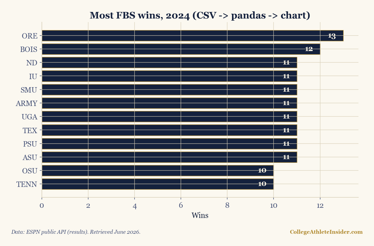
The output is unremarkable on purpose — that's the point. Once the three stages are wired together, the analysis is repeatable: next week, regenerate the CSV and rerun, and the chart updates with zero manual editing. Separating the stages (data → transform → display) is what lets you swap any one of them without breaking the others.
Why separate the stages
- The CSV is a checkpoint. You can inspect it, version it, or hand it to a non-coder. Bugs are easy to isolate to "before" or "after" the file.
- pandas is the right tool for the middle.
read_csv, filter,assign,groupby,sort_values— a handful of verbs cover most transforms. - Re-runnability beats cleverness. A pipeline you can rerun monthly is worth more than a brilliant one-off you can't reproduce.
Level up
- Parameterize the season (a command-line argument) so the same pipeline builds any year.
- Add a
groupby— e.g., average wins by conference — to go from a list to an insight. - Schedule it. A pipeline this clean is easy to run on a timer and publish to a static dashboard.
Sources & further reading
- pandas — pandas.pydata.org
- Companion code:
scripts/csv-to-chart-pipeline-python.py - Related: Style the chart · Publish it as a dashboard